Tokyo National Art Center
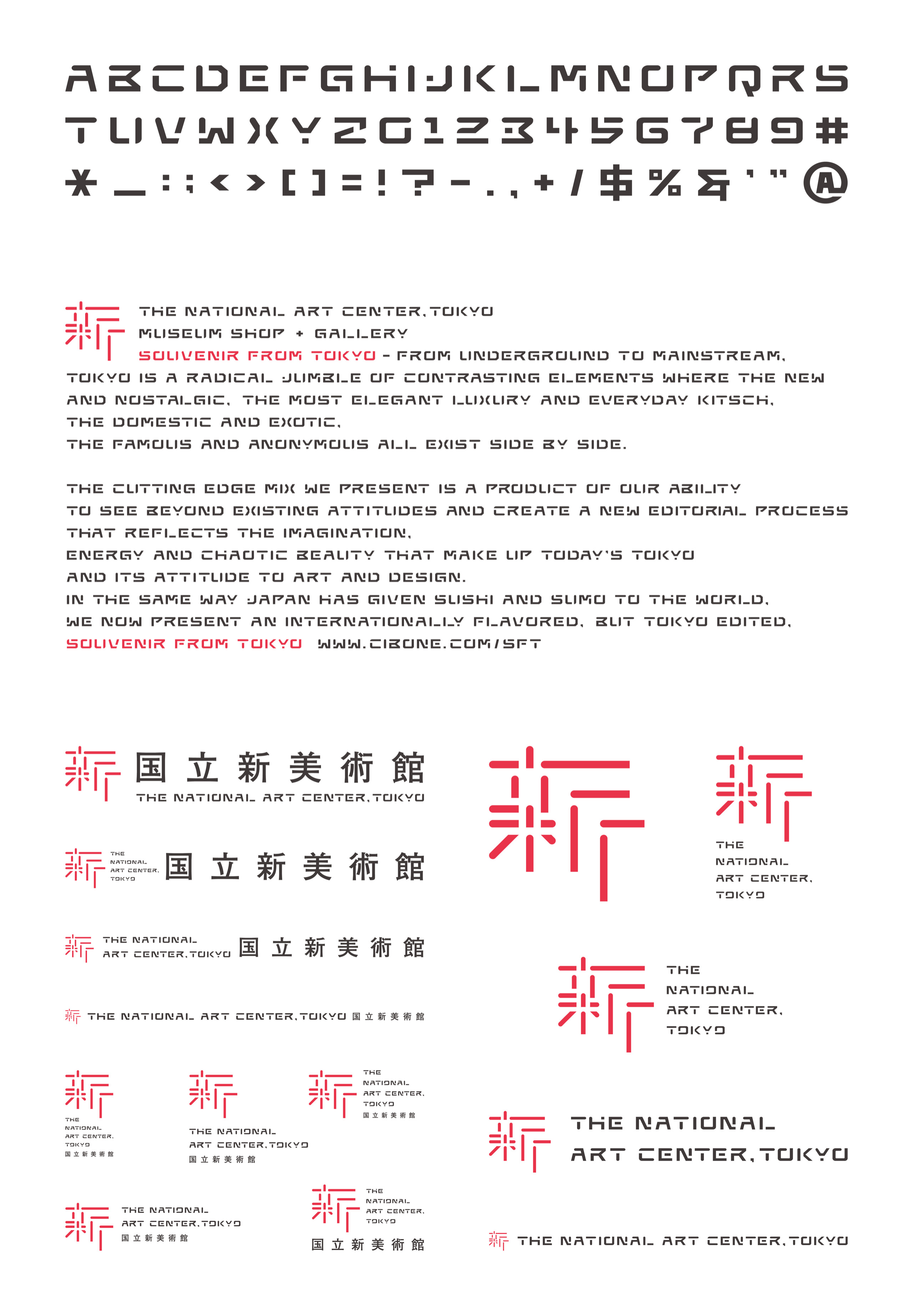
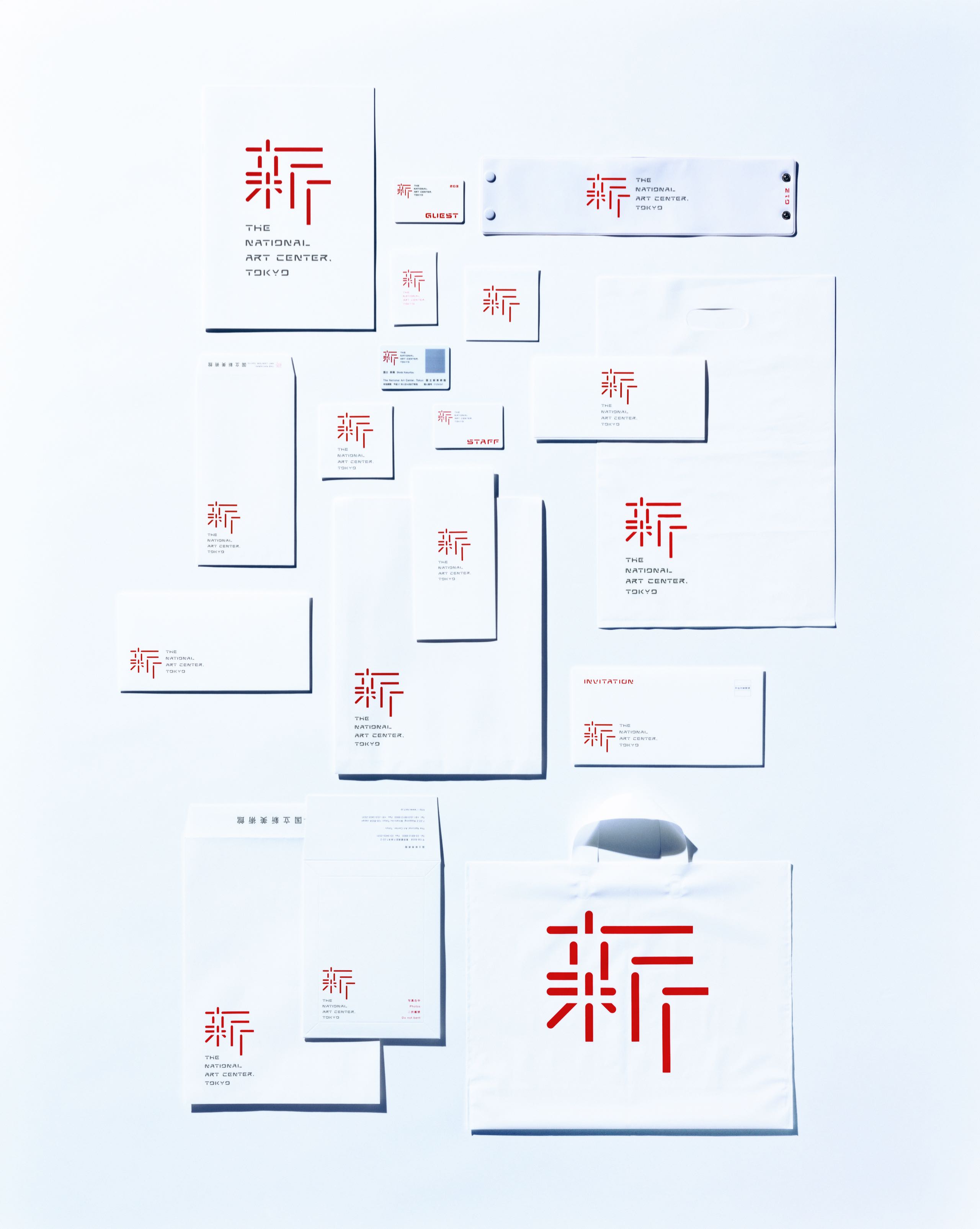
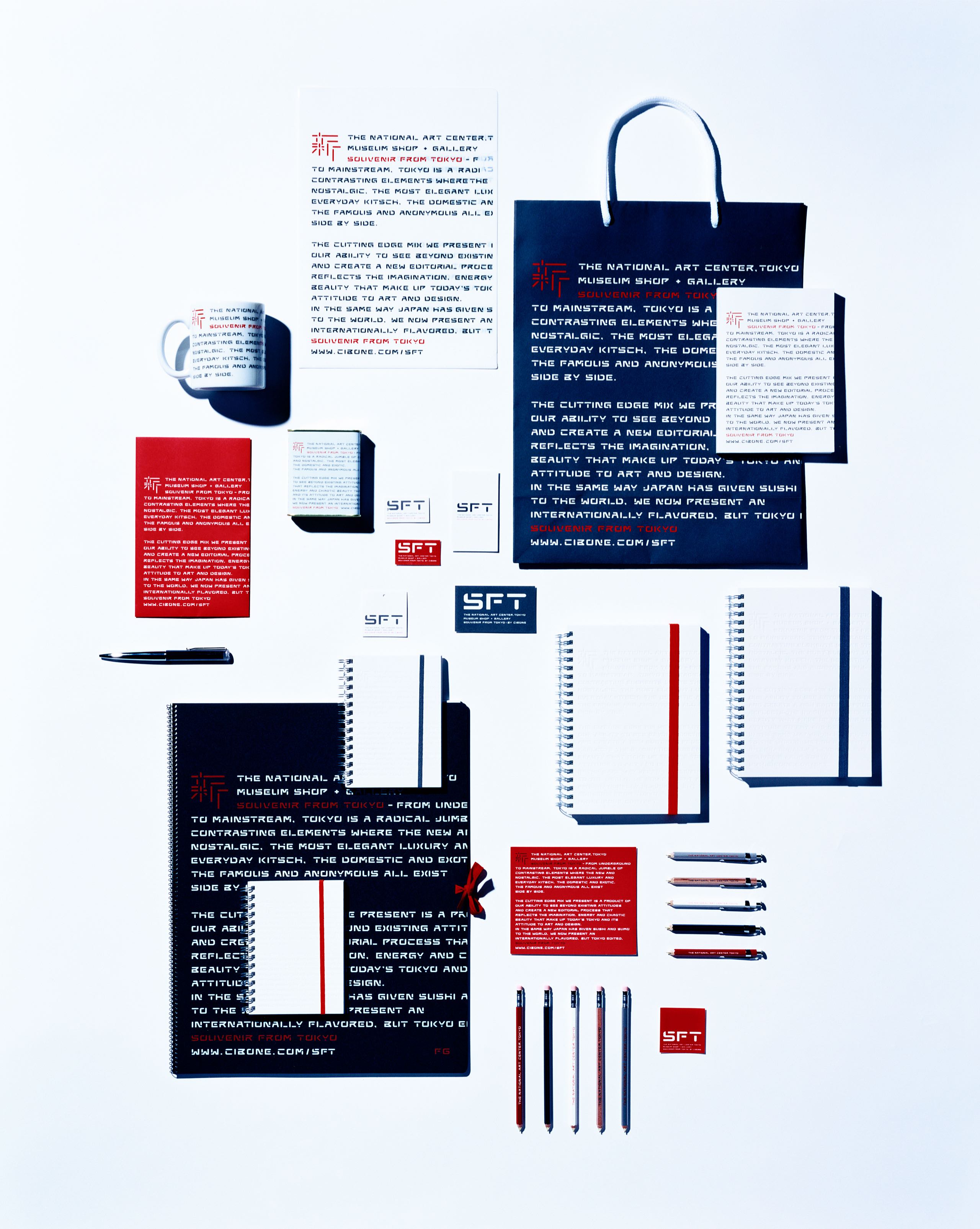
The visual identity of the National Art Center, Tokyo, the fifth and largest national museum in Japan, which opened in January 2007 in Roppongi, Tokyo was redesigned. It is the fifth national museum in Japan and the first to open in 30 years. NACT is unique; it holds no permanent collections, instead serving as an exhibition venue, art library, and source for art education and outreach activities. Kashiwa used the kanji character, ‘新’ (new) to symbolize its identity.
Inspired by architect Kisho Kurokawa’s use of large partitions to create separate elements within the massive space, the logo utilized the open space within the logo to convey the openness of the museum.
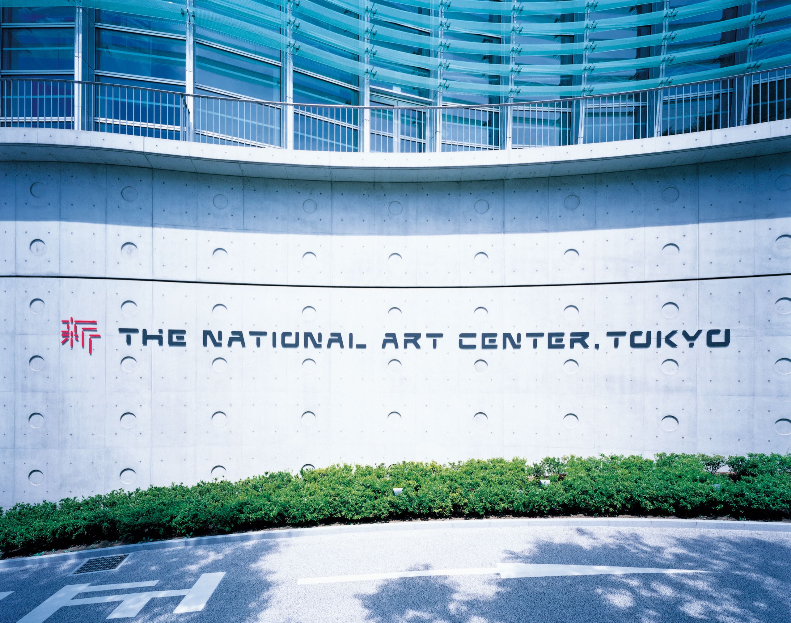
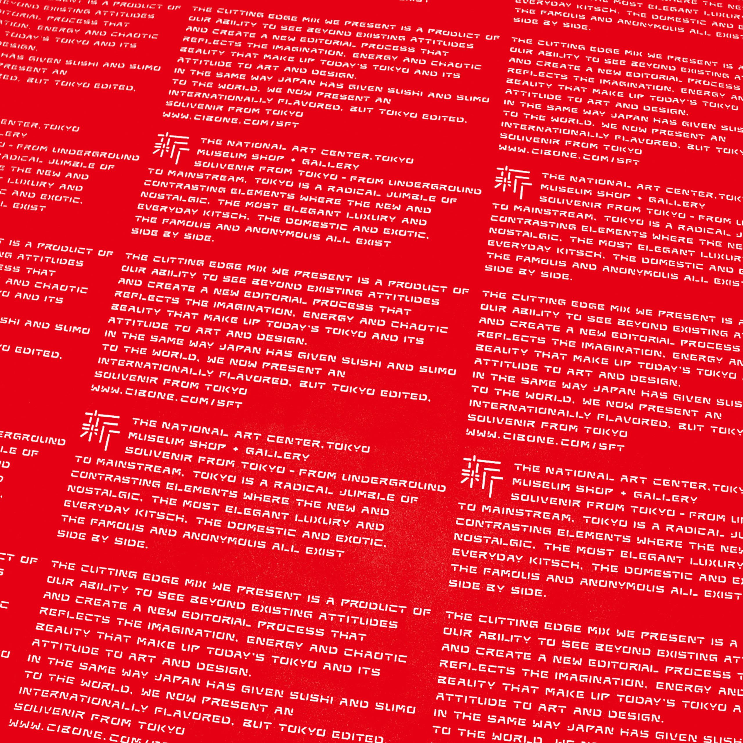
The original, stencil-like English and numeral fonts for the museum merchandise and the signage to express the openness of the museum and to unify its core values and unique architecture into one image.
The Japanese News Review of Art Center's Rebrand
2007年に東京・六本木にオープンした国立新美術館のVI設計では、「コレクションを持たない」「アートの情報センターとしての役割」など、従来の美術館にはなかった新規性に着目し、「新」という漢字をシンボルマークに据えた。建築家・黒川紀章氏が考案した独自のパーテーションシステムに着想を得て、すべてのエレメントを開いたマークのデザインには、「開かれた美術の場」というコンセプトが重ね合わされている。また、マークの造形を踏襲した欧文フォントを開発するなど、一貫したヴィジュアルコミュニケーションによって、美術館のあるべき姿や建築の特性を表現した。
街をメディアに見立てた広告施策の先駆けとなったこの仕事は、その年のデザイン賞を総なめするなど高く評価された。赤、青、黄の3色で構成されたシンボルマークは、メンバーの個性や人数とは関係なく、当初の依頼だったCDというパッケージの特性から着想を得ている。CDは、表蓋、裏蓋、ディスクトレイというパッケージを構成する3つのパー。
CDやコンサートグッズなどの商品のデザインにとどまらず、グループをシンボライズするアイコンを設計するアプローチは、世界的な企業の多くがヴィジュアルアイコンを用いたコミュニケーション戦略を通じてブランド価値を高めるなど、ブランディングの概念が注目され始めていた当時の時代背景ともリンクしている。