SMAP!
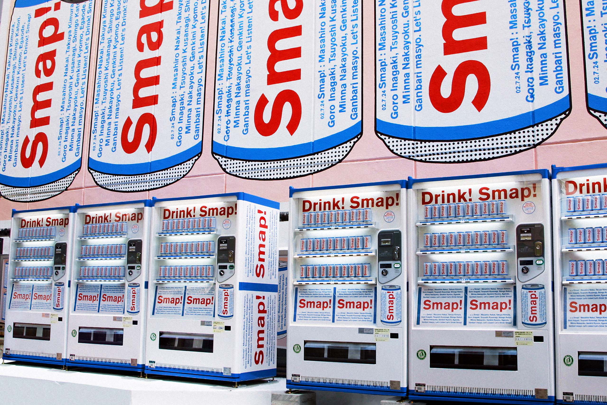
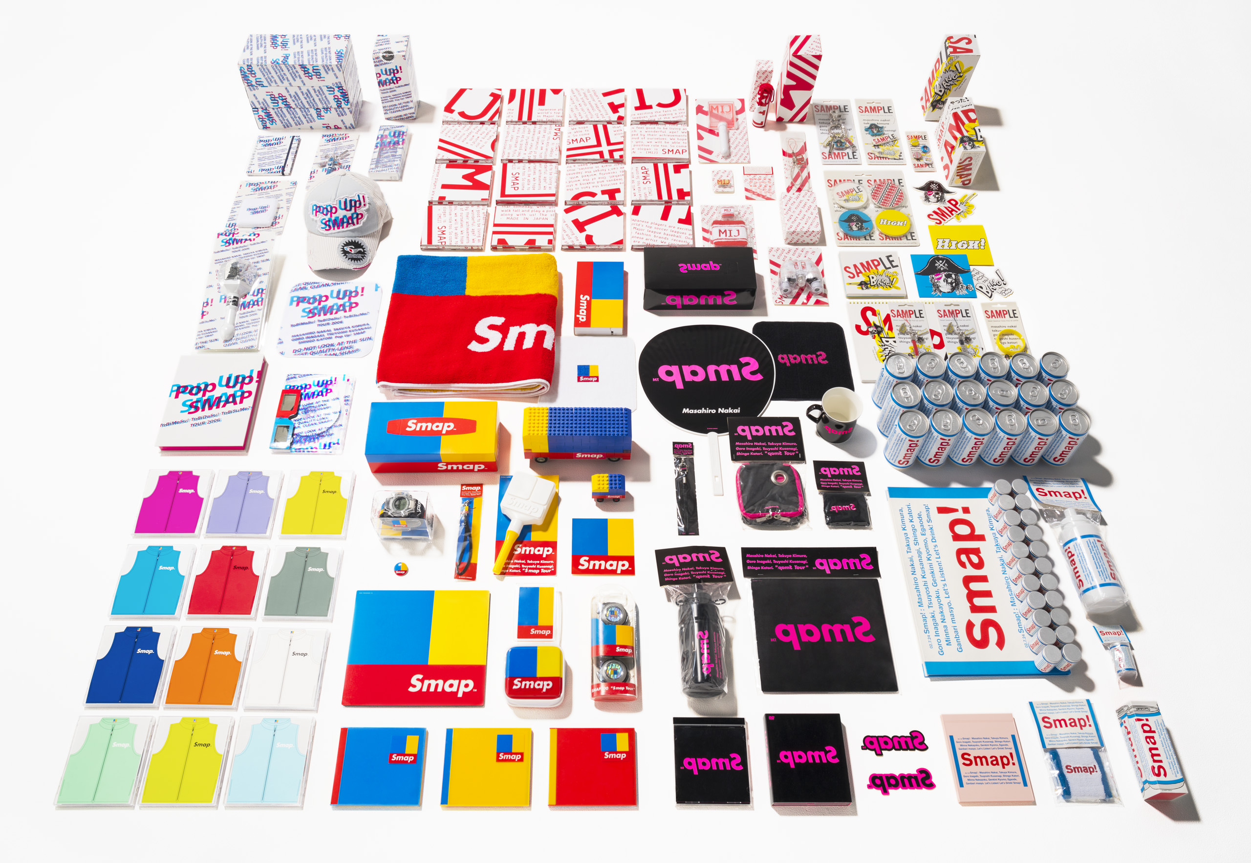
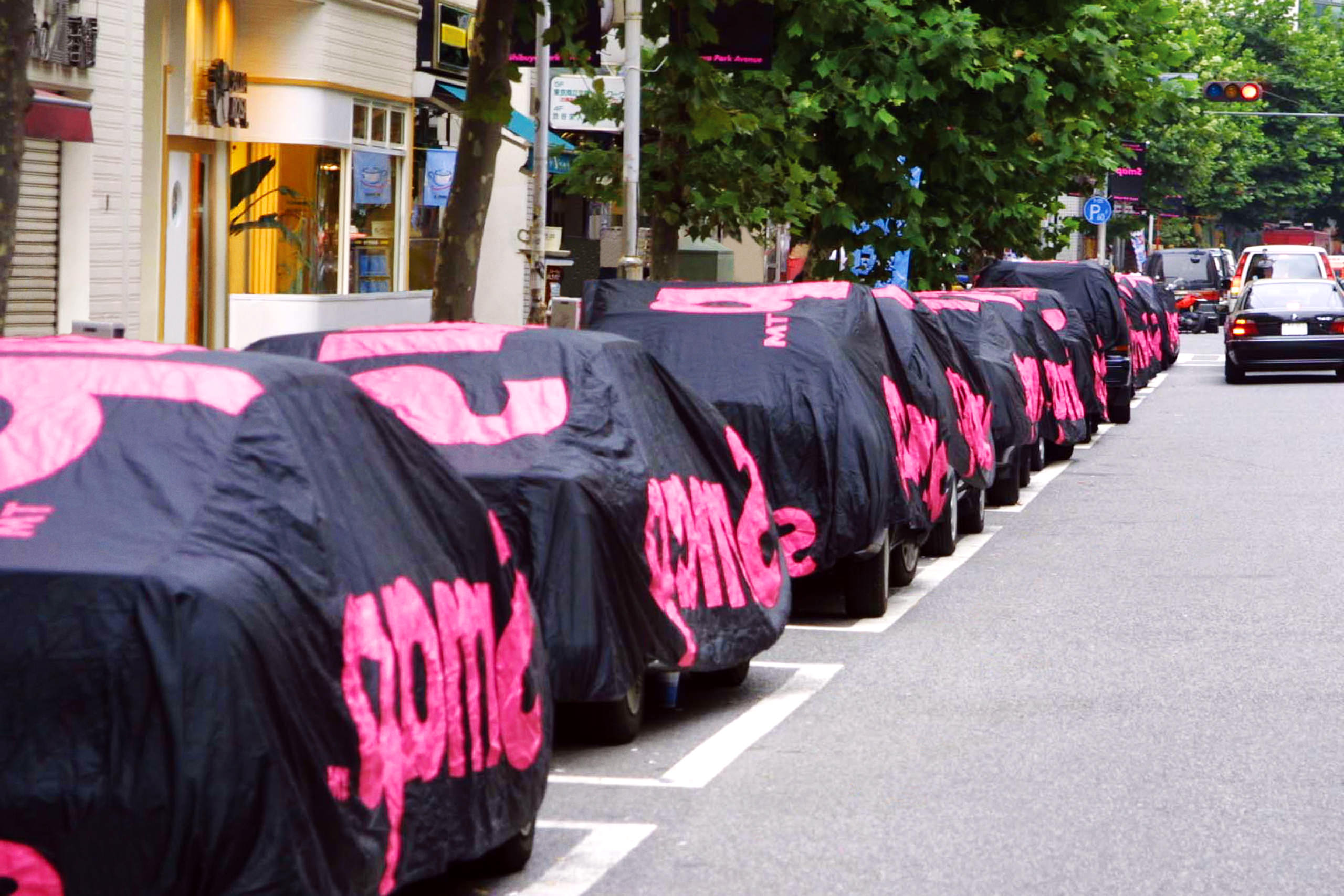
Kashiwa Sato experimented new communication strategy. Denying traditional advertising campaign, he introduced a cool campaign method for the 10th anniversary project of SMAP, one of the leading Japanese pop groups. Bringing the new perspective that ‘a pop group is the brand’, Kashiwa re-positioned SMAP and created a communication strategy with a unique visual identity used on the CD jacket design and a variety of concert merchandise.Kashiwa blanketed Shibuya with banners hung from the street lamps and with special designed covers for the buses in addition to newspaper ads and a poster campaign.
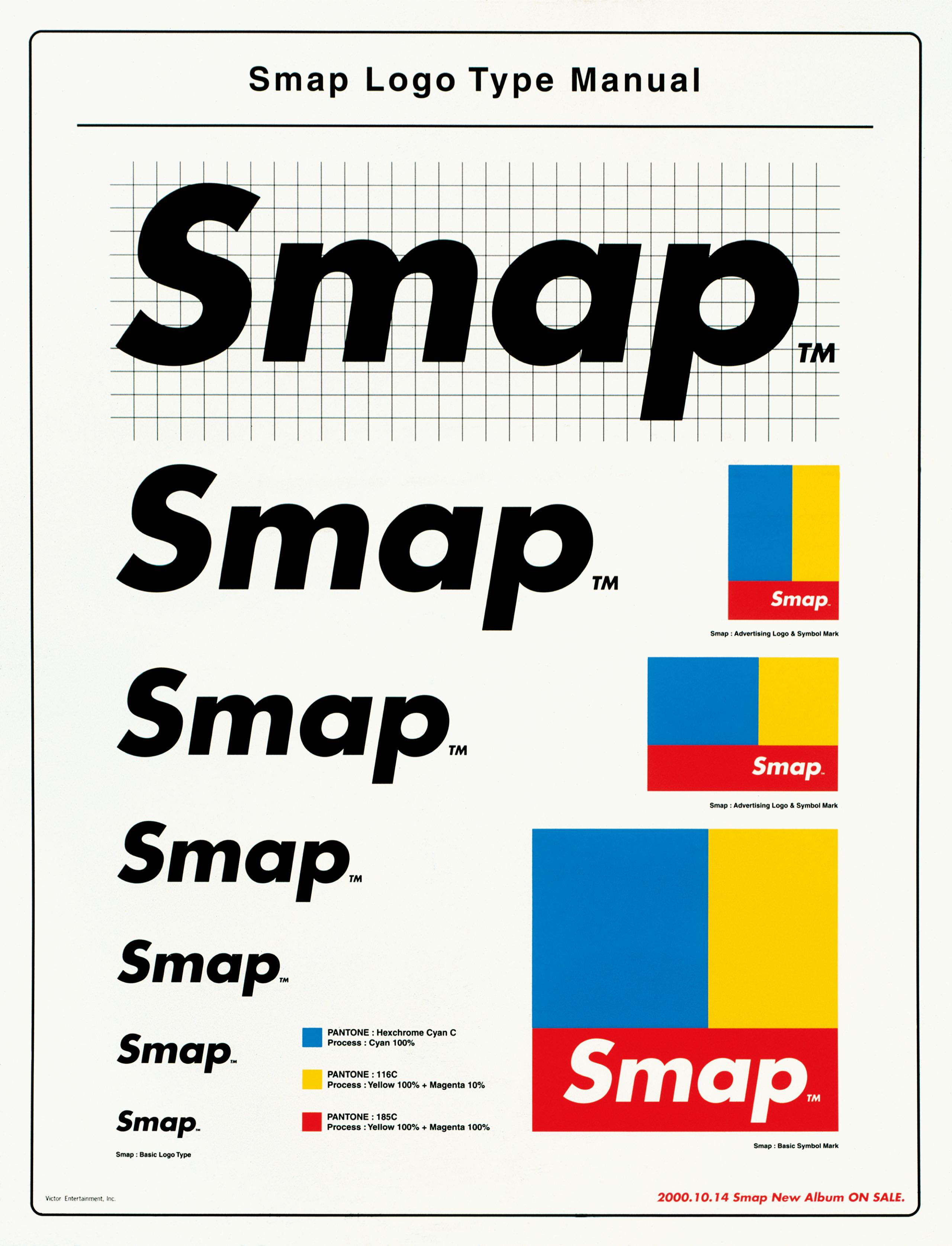
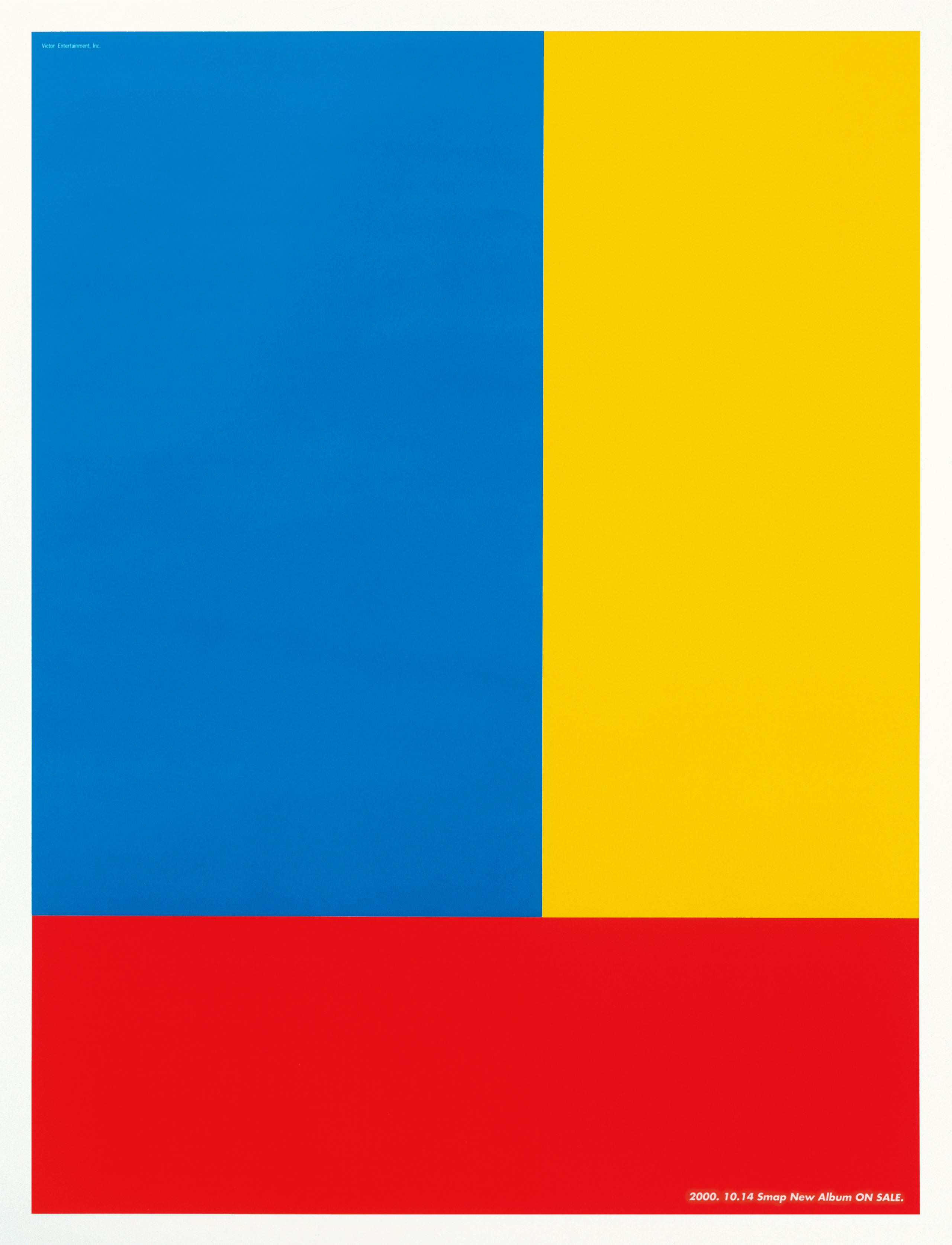
He modified the position and red/blue/yellow ratio in the base design, which recalled a three-colored flag. The creation of the symbol to identify the pop group went beyond the usual production of CD jacket and concert merchandise, tapping into the trend of global companies increasing their corporate value through the power of visual identity.
Witnessing the decline in the power of mass media, Kashiwa decided to forego the traditional route of heavy mass media advertising. Instead, he created a buzz through a variety of street activity; he flooded Shibuya with SMAP’s logo just before the CD launch and then ran newspaper ads featuring the tricolored flag logo.
The Japanese comments
デビュー10周年を機に展開されたSMAPのキャンペーンでは、マスメディアを通じたコミュニケーションとは一線を画した実験的な試みを展開した。CDやコンサートグッズのデザインに端を発したこのプロジェクトでは、グループをひとつのブランドに見立て、記号性の高いヴィジュアル・アイデンティティを設計。これを新聞広告やポスターのみならず、ラッピングバスや街灯フラッグなどに展開し、グラフィカルなアイコンを街中に増殖させた
街をメディアに見立てた広告施策の先駆けとなったこの仕事は、その年のデザイン賞を総なめするなど高く評価された。赤、青、黄の3色で構成されたシンボルマークは、メンバーの個性や人数とは関係なく、当初の依頼だったCDというパッケージの特性から着想を得ている。CDは、表蓋、裏蓋、ディスクトレイというパッケージを構成する3つのパー。

CDやコンサートグッズなどの商品のデザインにとどまらず、グループをシンボライズするアイコンを設計するアプローチは、世界的な企業の多くがヴィジュアルアイコンを用いたコミュニケーション戦略を通じてブランド価値を高めるなど、ブランディングの概念が注目され始めていた当時の時代背景ともリンクしている。